

Branding, UX/UI, WEB
Originally launched as UHUE, the brand set out to revolutionize the beauty industry by reimagining how cosmetics are created and experienced. Our vision was to empower individuals to design custom products tailored to their unique skin types and personal styles. For the first time, anyone could formulate cosmetics from the comfort of their home and share them globally, ushering in a new ecosystem that celebrates limitless diversity and individual creativity.
While the technology developed at Unbox was groundbreaking, the original branding did not fully capture our mission to build a forward-thinking, emotionally resonant, and expressive identity. Through our work, we discovered our audience was increasingly drawn to beauty experiences that are playful, collaborative, and culture-defining.
As we reimagined the brand, our goal was to better reflect its purpose and potential. Through rigorous exploration, we arrived at a new name: CO.8. Abstract yet meaningful, "CO" stands for community, collaboration, and color, while the number "8" symbolizes both the modular nature of the product and an infinite loop of creation and personalization.
This transformation marks a shift beyond the present, toward the future of luxury cosmetics, embodied in our new tagline: “Beauty Personified.”

UI/UX
The CO.8 ecosystem prioritizes user experience to build trust and comfort for an emerging brand powered by innovative technology. Seamless, intuitive, and visually expressive across digital and physical touchpoints,it’s designed to attract, engage, and retain loyal customers.
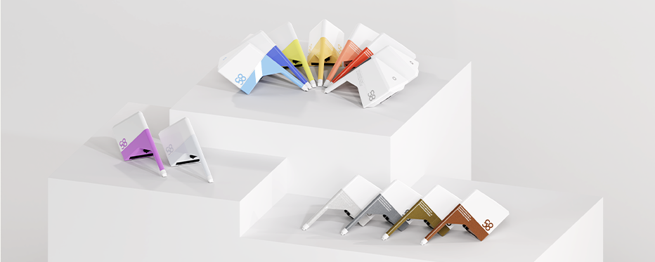
The website functions as both an immersive storytelling platform and an educational tool, guiding users through shade and accent creation while the technology behind it.. A future-forward interface for the embedded system and mobile app complements the sleek black tempered-glass device, echoing the premium feel of the black tempered-glass device.
Graphic elements were intentionally selected to enhance the user flow: a minimalist bento-box style organizes the main pages, while three-dimensional elements and neumorphism create a tactile sense of connection to the creation process.. Together, this unifies a human-centered experience that is layered and innovative.


Brand Messaging
In shaping a distinct brand identity, a key part of our work is translating vision into voice. Through in-depth research into target audiences and user personas, we identify and articulate a written personality that effectively conveys the brand’s values. Strong brand messaging creates a cohesive language that unifies visual systems with written and verbal communications. Ultimately, our goal is not only to define this language but to build a flexible messaging system that grows and evolves alongside the brand.

Visual System
Developing a strong visual system is essential for creating a cohesive framework of brand language, assets, expression, and guidelines that can be applied consistently across media and applications. The CO.8 visual system is designed to balance structured clarity with playful exploration, introducing a visual language that feels both intentional and open-ended. Freeform motion, floating 3D elements, and ethereal patterns infuse a sense of movement and discovery, while vibrant color accents encourage interaction and experimentation.


Typography & Color Palette
Fonts and colorways are core identity elements that play a vital role in building a cohesive brand identity and a strong visual system. For CO.8, the Mundial font was selected for its bold, contemporary sans-serif structure, offering confident weight and clarity that stand out across both digital and physical environments. To complement it, IBM Plex Mono introduces a technical rhythm, reflecting CO.8’s sophisticated capabilities. Warm ivory and grayscale tones provide a grounded, comforting backdrop, while vibrant accent colors in cartridge identification add a playful edge to an otherwise sleek, luxury aesthetic.


LOGO DESIGN
A successful logo should embody a brand’s ethos while resonating with its core audience. With CO.8’s target market identified as creative and expressive individuals, the identity was designed to be both clean and innovative. The logo is built on bold simplicity and refined clarity, featuring confident lines that convey modern luxury. A geometric sans-serif typeface reinforces structure and balance, anchoring the visual system with precision and sophistication.

Concept Development
In building a brand for a competitive market like the beauty industry, it is essential to define where the company and its products belong. With CO.8, our goal was to bridge the space between luxury, clean beauty, and Gen Z’s expressive spirit. Research and competitor analysis revealed key market opportunities, while moodboards and user personas helped us envision a brand that feels both elevated and experimental. The process was strategic yet creative, blending visual research with cultural insights to shape a direction that is bold, minimal, and emotionally resonant. This foundation informed the creation of a brand designed not only to compete but to influence emerging trends.


